Until recently, Documenso provided a set of 5 fields for document signing: signature, email, name, date, and a text field for additional information. While these fields covered the basic requirements for document signing, we recognized the need for more flexibility and variety.
As a result, we've decided to introduce several additional fields, such as:
- (an improved) Text field
- Number field
- Radio field
- Checkbox field
- Dropdown/Select field
These new fields bring more flexibility and variety to Documenso. As the document owner, they allow you to gather more specific or extra information from the signers.
New Fields Introduction
Let's take a closer look at each new field type.
Text Field
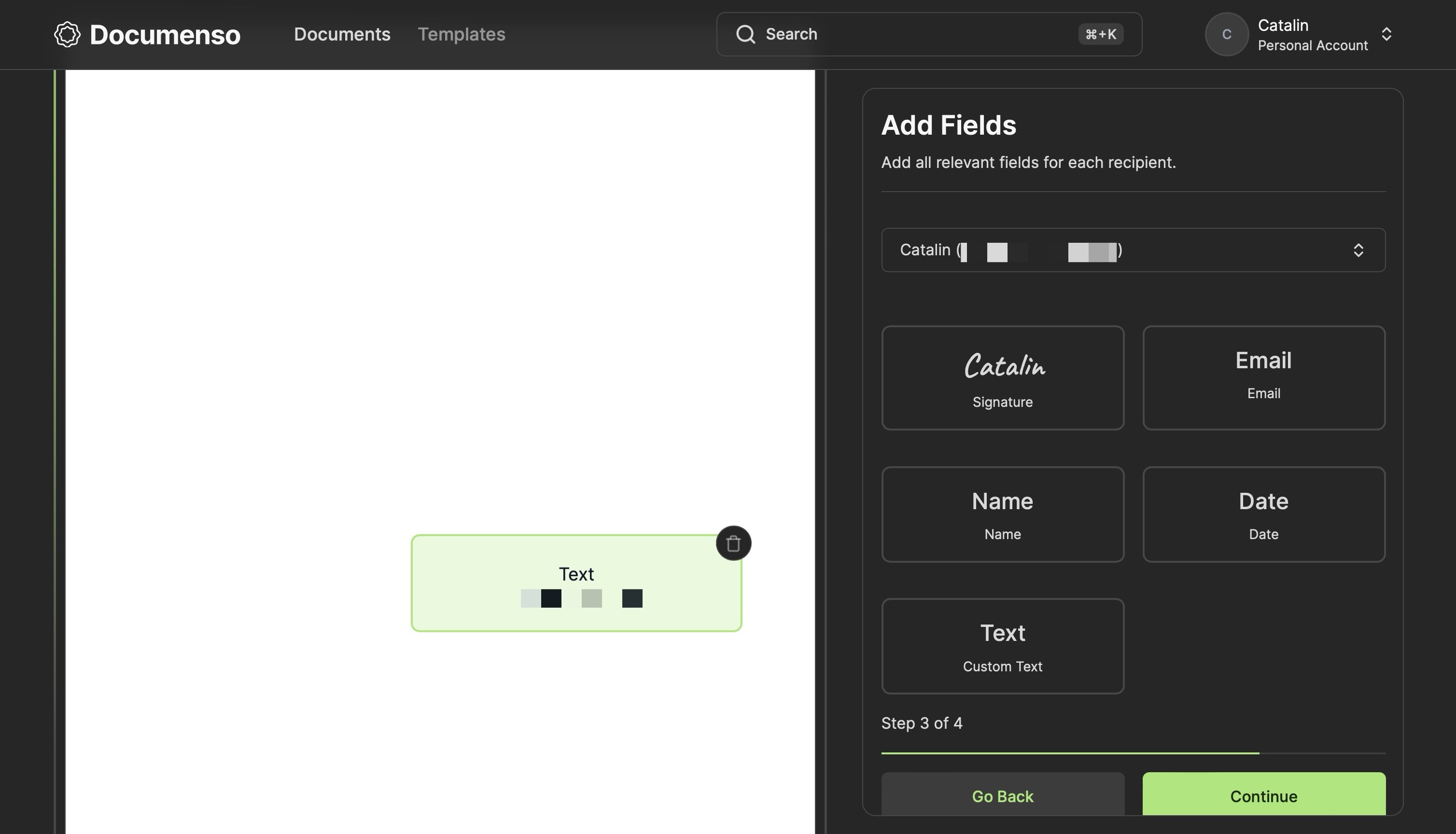
While the text field was previously available, it could not be configured. It was a simple input box where signers could enter a single line of text.
The image illustrates the old text field in the document editor.
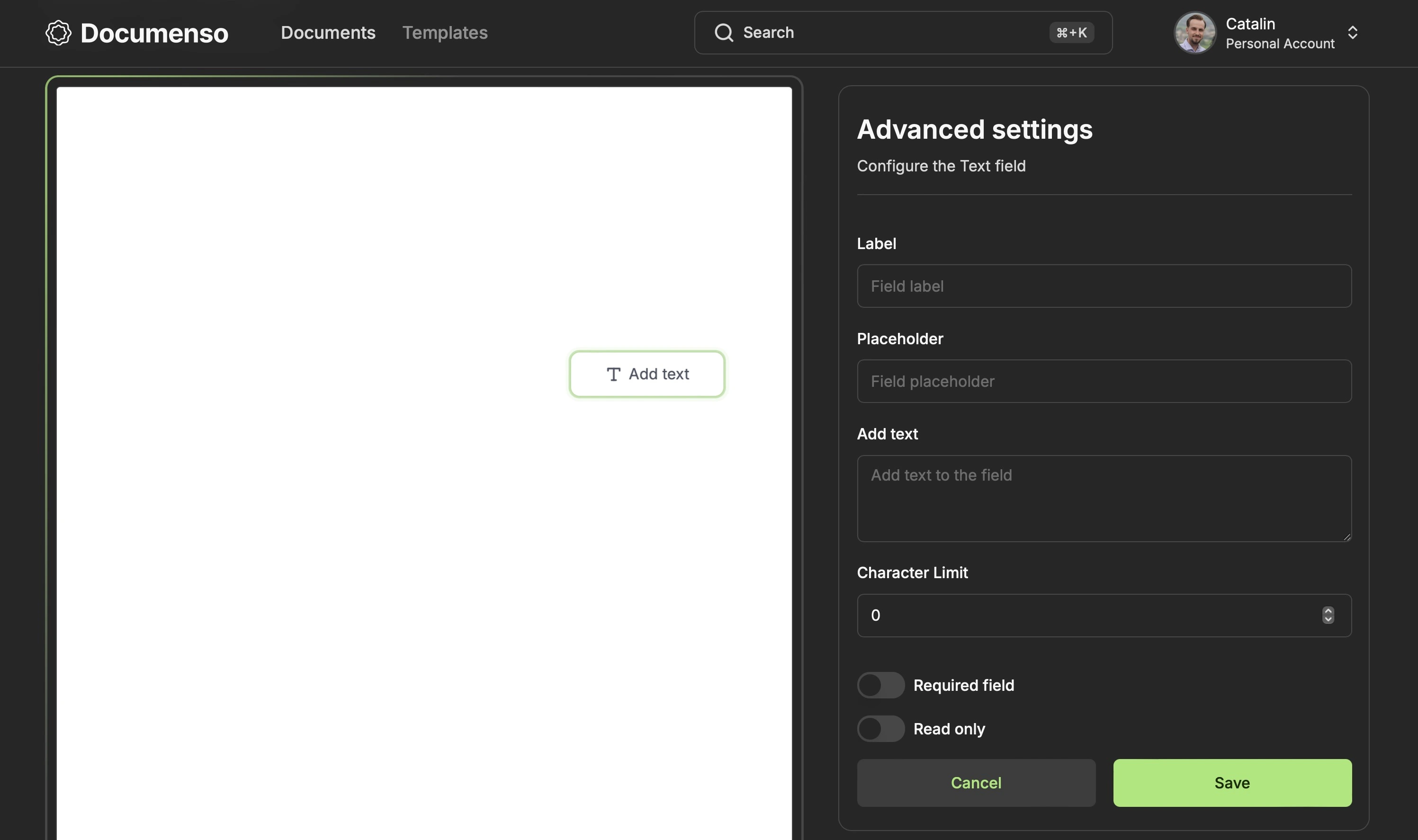
The revamped text field now offers a range of configuration options, allowing you to:
- Add a label, placeholder, default text, and character limit
- Set the field as required or read-only
On the signing side, the field remained mostly the same visually. The only thing that changed is the functionality, which needs to take into consideration the validation rules. For example, if the field is required, the signer must enter a value to sign it. Or, if the field has a character limit, the value entered by the signer shouldn't exceed the limit.
The image below illustrates four different text fields with various configurations.
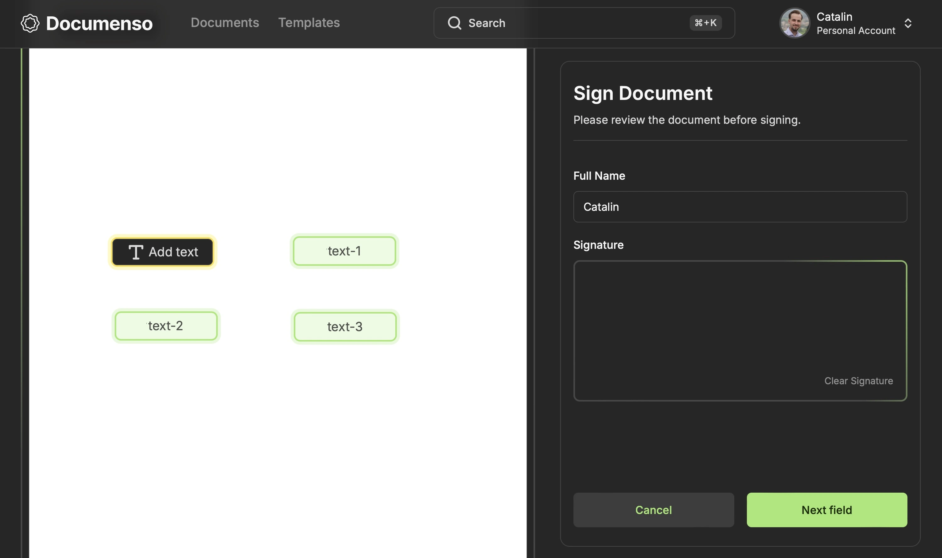
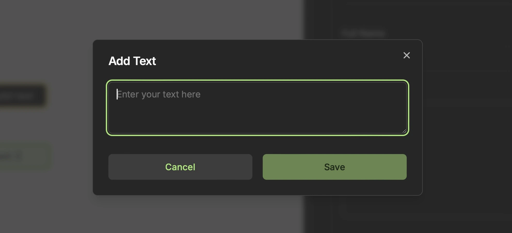
The first text field has no default value ("Add text") or configuration. You can sign the field by entering any text.
The second text field, "label-1"/"text-1", has the following configurations:
- Label
- Placeholder
- Default text
- Character limit
Since there is a default value, the field auto-signs with that value. However, you can re-sign the field with a new value that doesn't exceed the character limit.
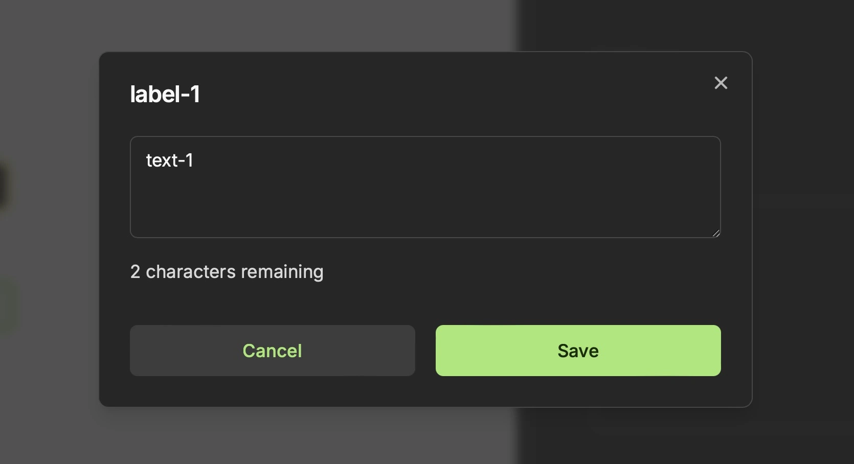
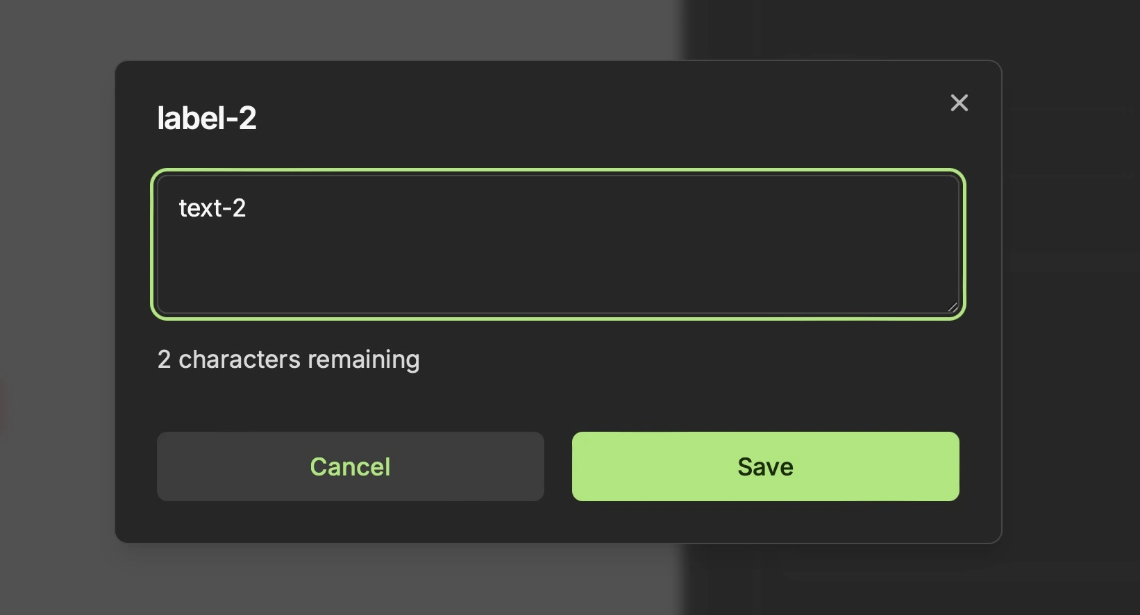
The third field, "label-2"/"text-2", has the same configurations as the second one, with one addition - the required option is checked. When the field is marked as required, you must sign it before completing the document.
Apart from that, it works like the second field.
The fourth field, "label-3"/"text-3", has the same configurations as the second one, with one addition—read-only is checked. That means the field auto-signs with the default value, and you cannot modify it.
Unsigned Fields
You can unsign a field to change the value and sign it again. The unsigned state of the field varies depending on its configuration:
- If the field has a label, it displays it instead of "Add text" when unsigned.
- If the field has a default value, the default value will be shown when unsigned.
- If the field has both a label and a default value, the label will take precedence and be displayed when unsigned.
The image below shows the unsigned state of the text fields.
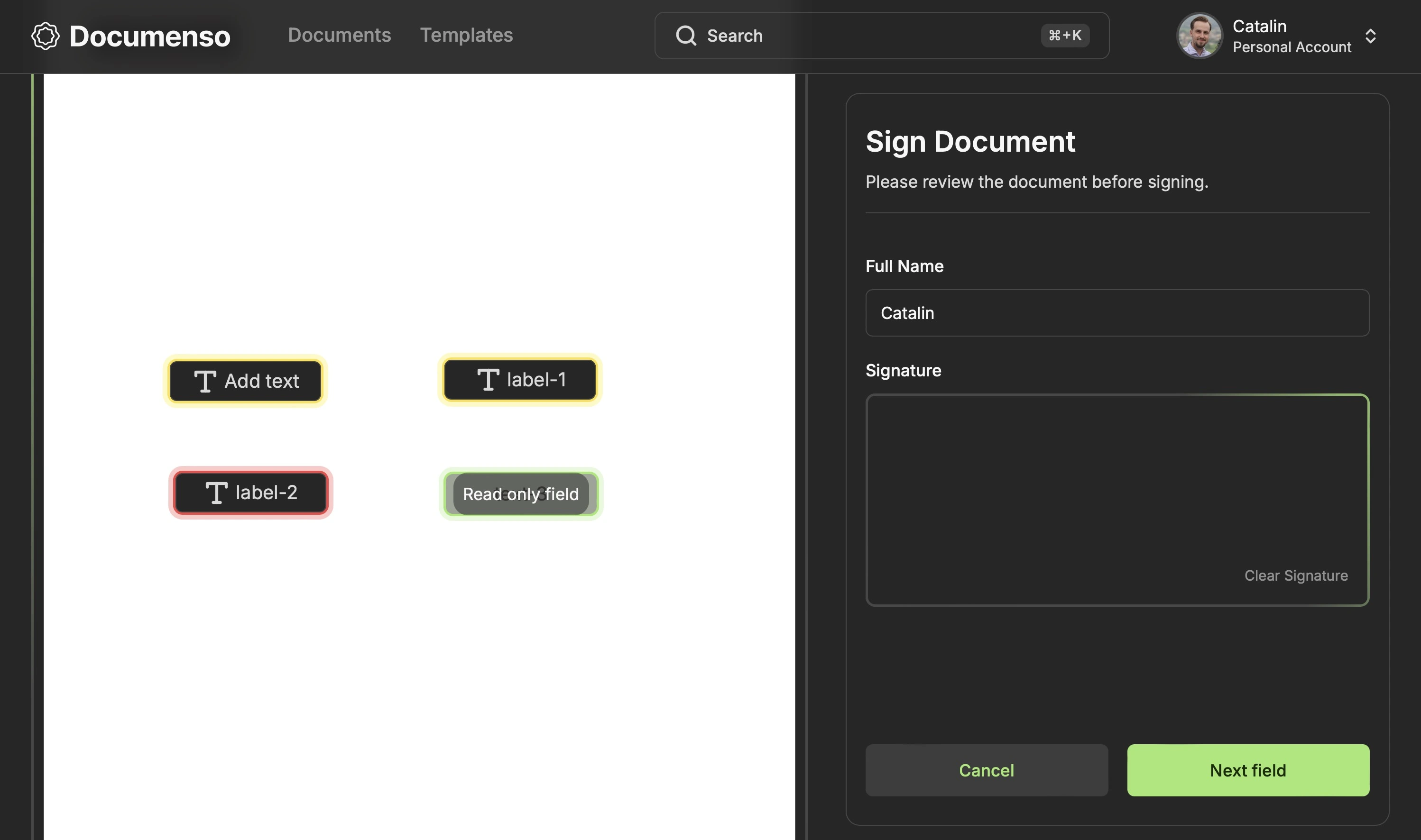
The only exception is the fourth, read-only field, which cannot be unsigned or modified.
Number Field
We also introduced a new "Number" field for inserting and signing documents with numeric values. This field helps collect quantities, measurements, and other data best represented as numbers.
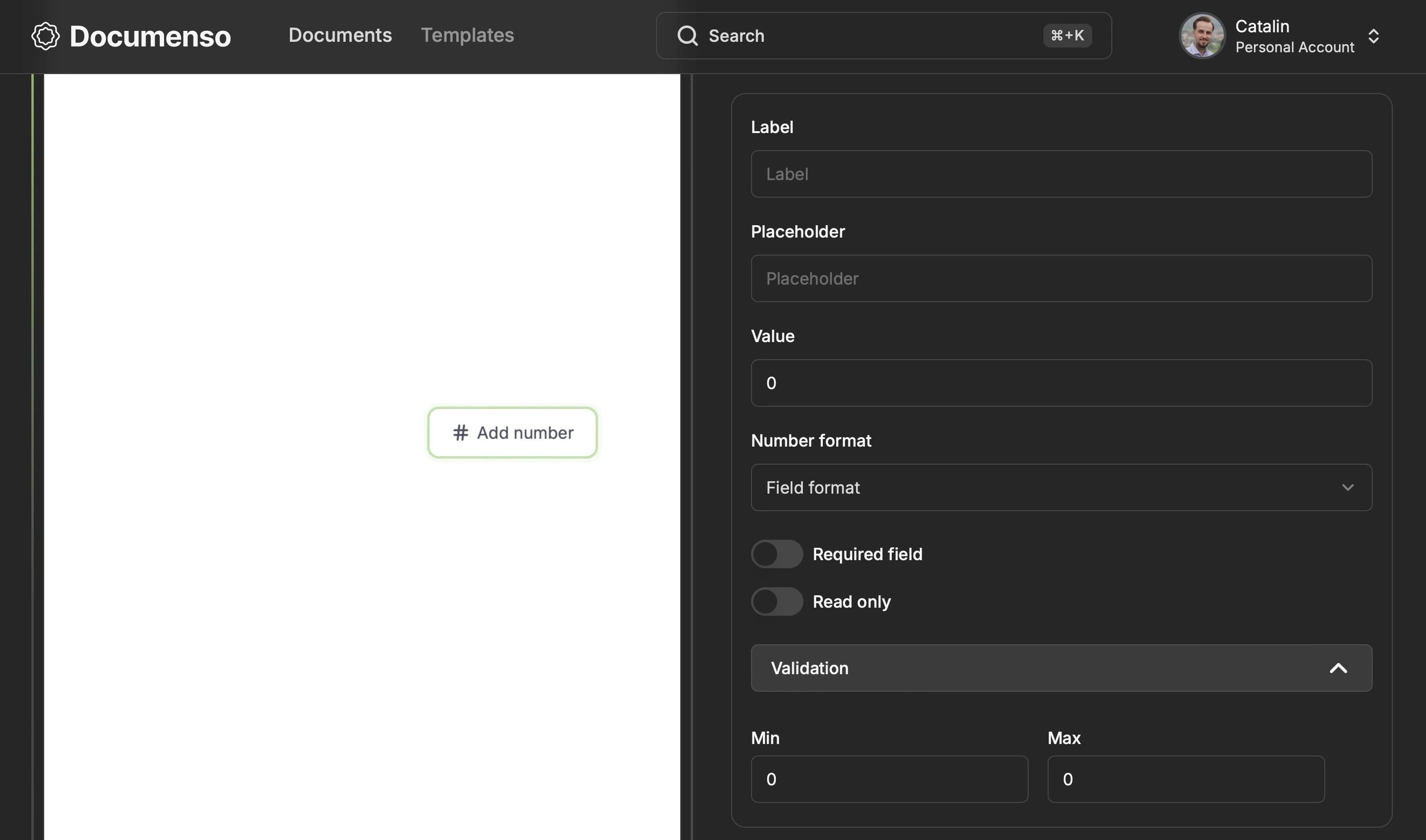
The "Number" field offers a range of configuration options, which allows you to:
- Set a label, placeholder and default value
- Specify the number format
- Mark the field as required or read-only
- Specify minimum and maximum values
The Number field looks and works similarly to the Text field. The difference is that it accepts only numeric values and has 2 additional configurations: the number format and the minimum and maximum values.
Radio Field
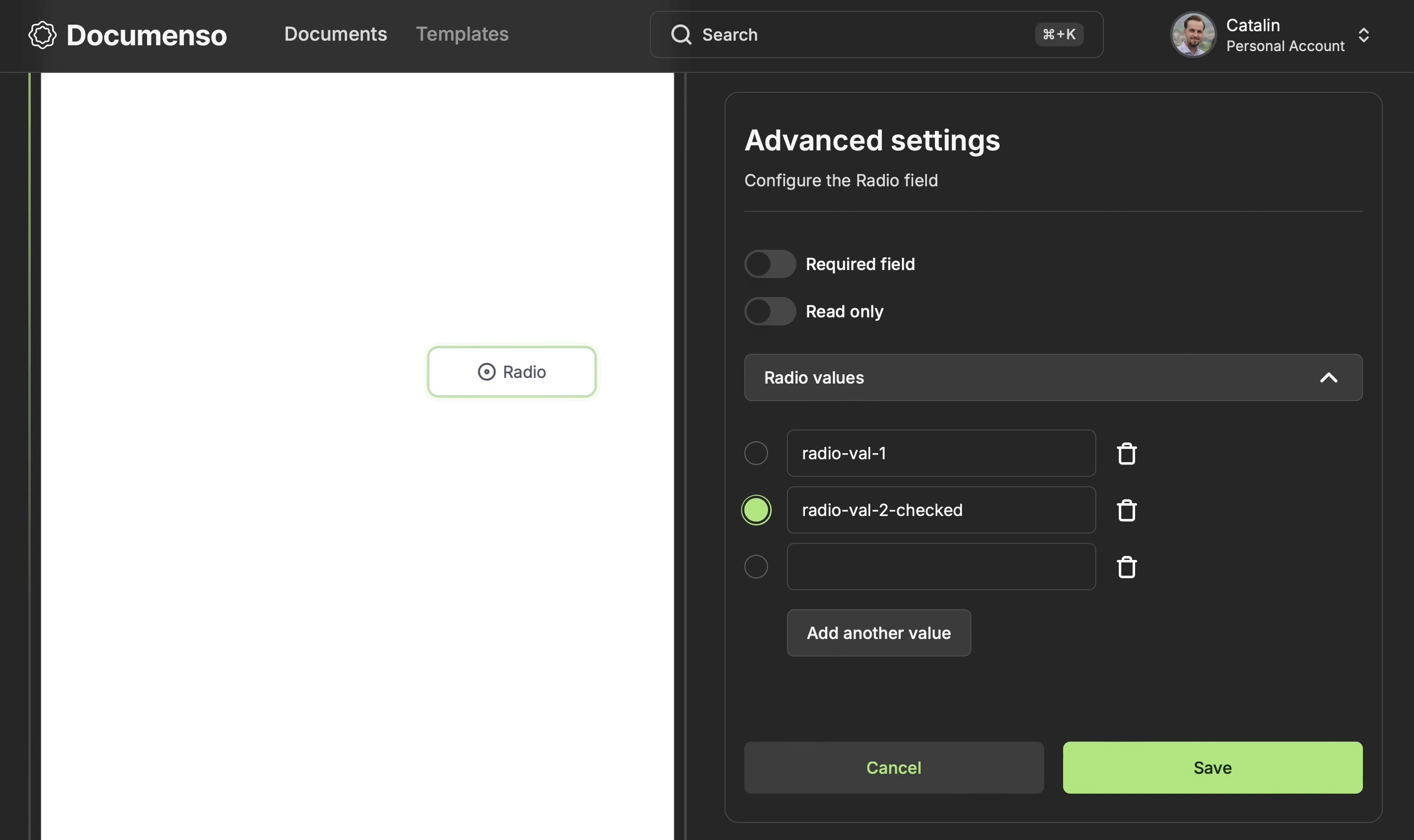
Radio buttons allow signers to select a single option from a pre-defined list the document owner sets.
Before sending the document for signing, you must add at least one radio option, which can contain a string or an empty value and can be checked or unchecked. However, it's important to note that only one option can be checked at a time.
When it comes to field configuration, you can mark the field as required or read-only.
The image below shows what the signer sees after the document is sent for signing.
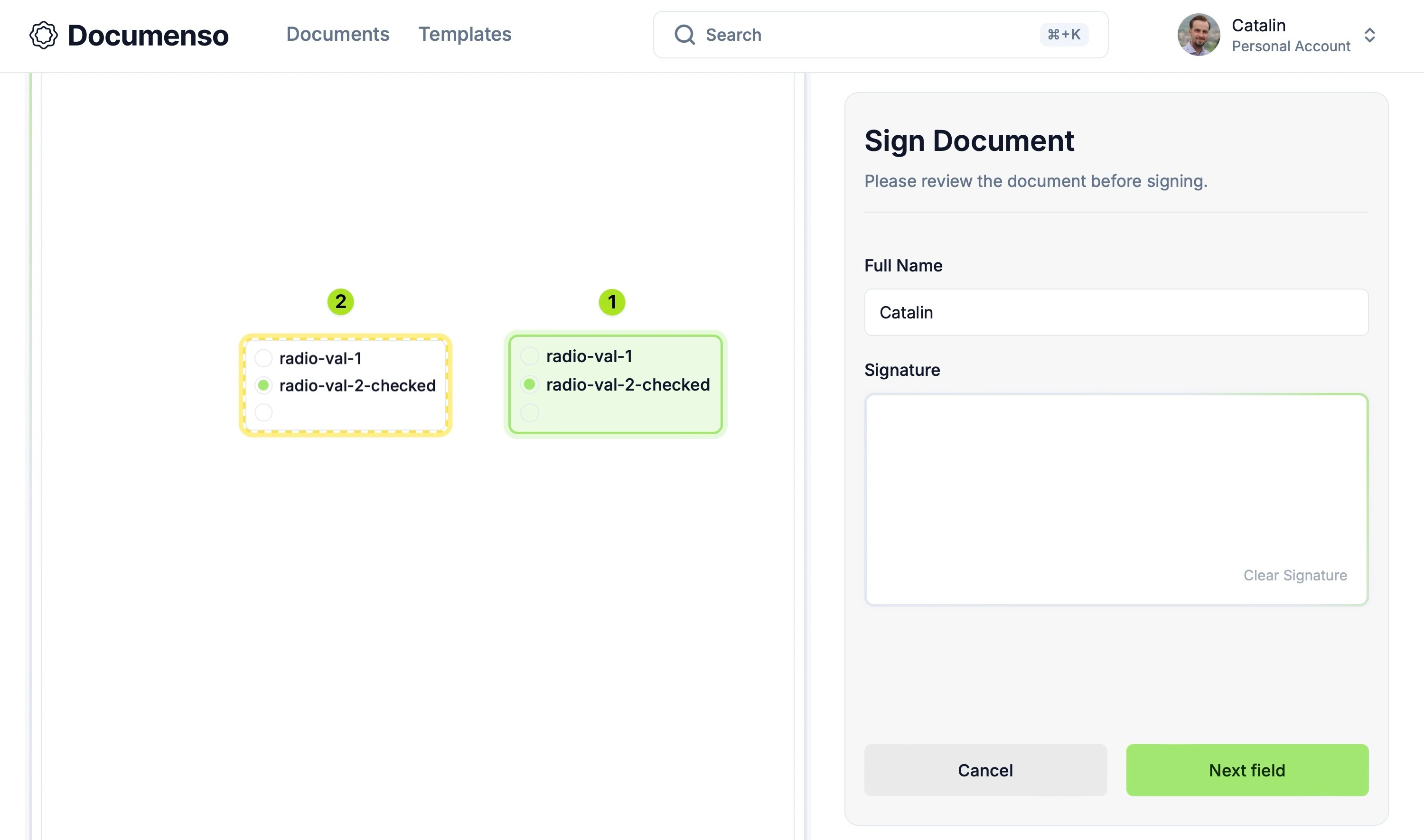
Note: The image is modified to display both the unsigned and signed states of the field.
Since the field has a preselected option (option radio-val-2-checked), it will automatically sign with that value and appear like the field marked with the number 1.
If the field is not read-only, the signer can:
- Unsign the field and choose another option by clicking on it.
- Re-sign with the default value by refreshing the page when the field is unsigned.
However, if the field is marked as read-only, the signer cannot modify the preselected value.
Dropdown/Select Field
We have also introduced a new "Dropdown/Select" field that allows signers to pick an option from a pre-defined list of choices. This field type is ideal for scenarios with limited valid options, such as selecting a country, state, or category.
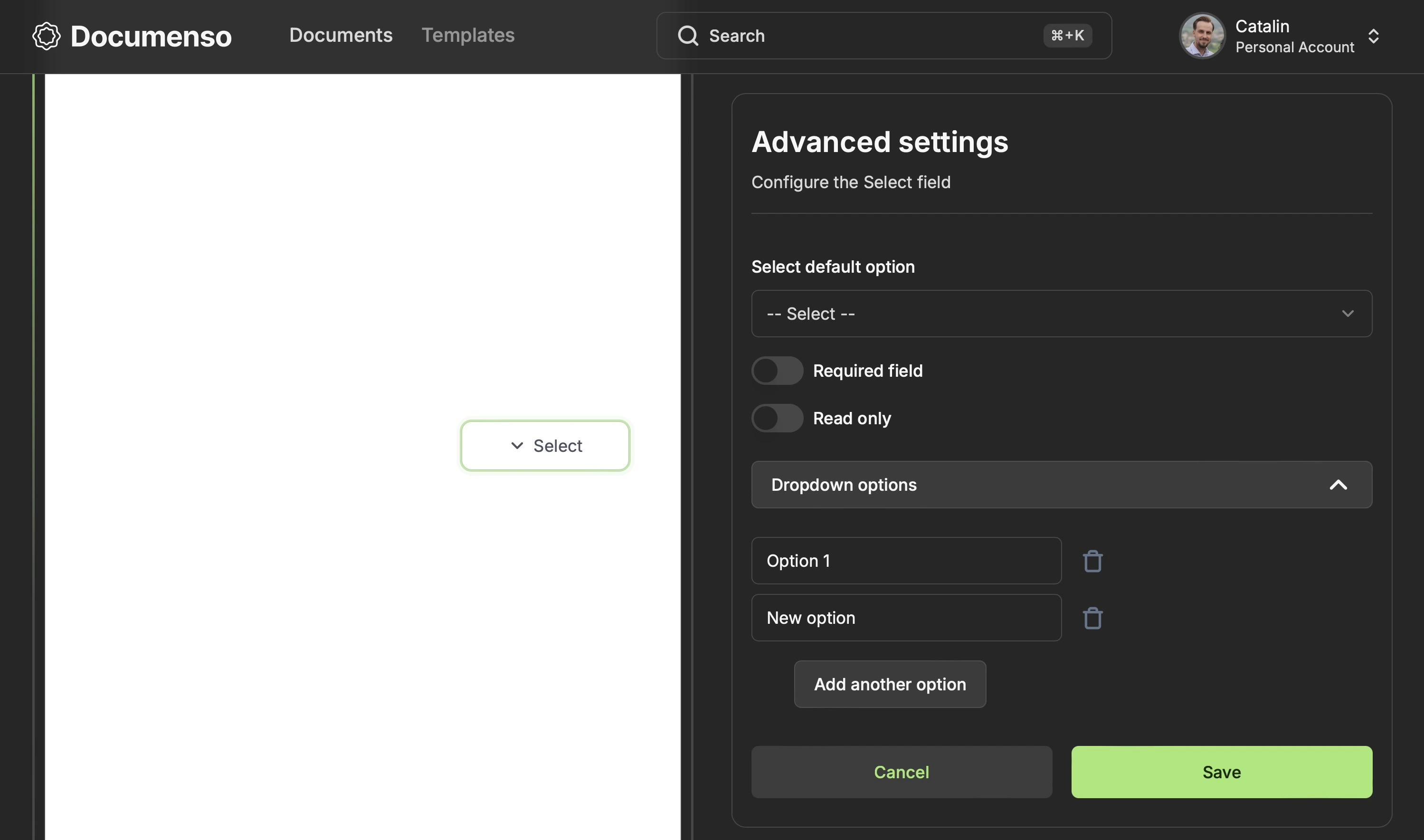
When setting up a "Dropdown/Select" field, you can:
- Add multiple options
- Mark the field as required or read-only
- Pick a default option from the list of choices
On the signing page, the "Dropdown/Select" field appears as shown below:
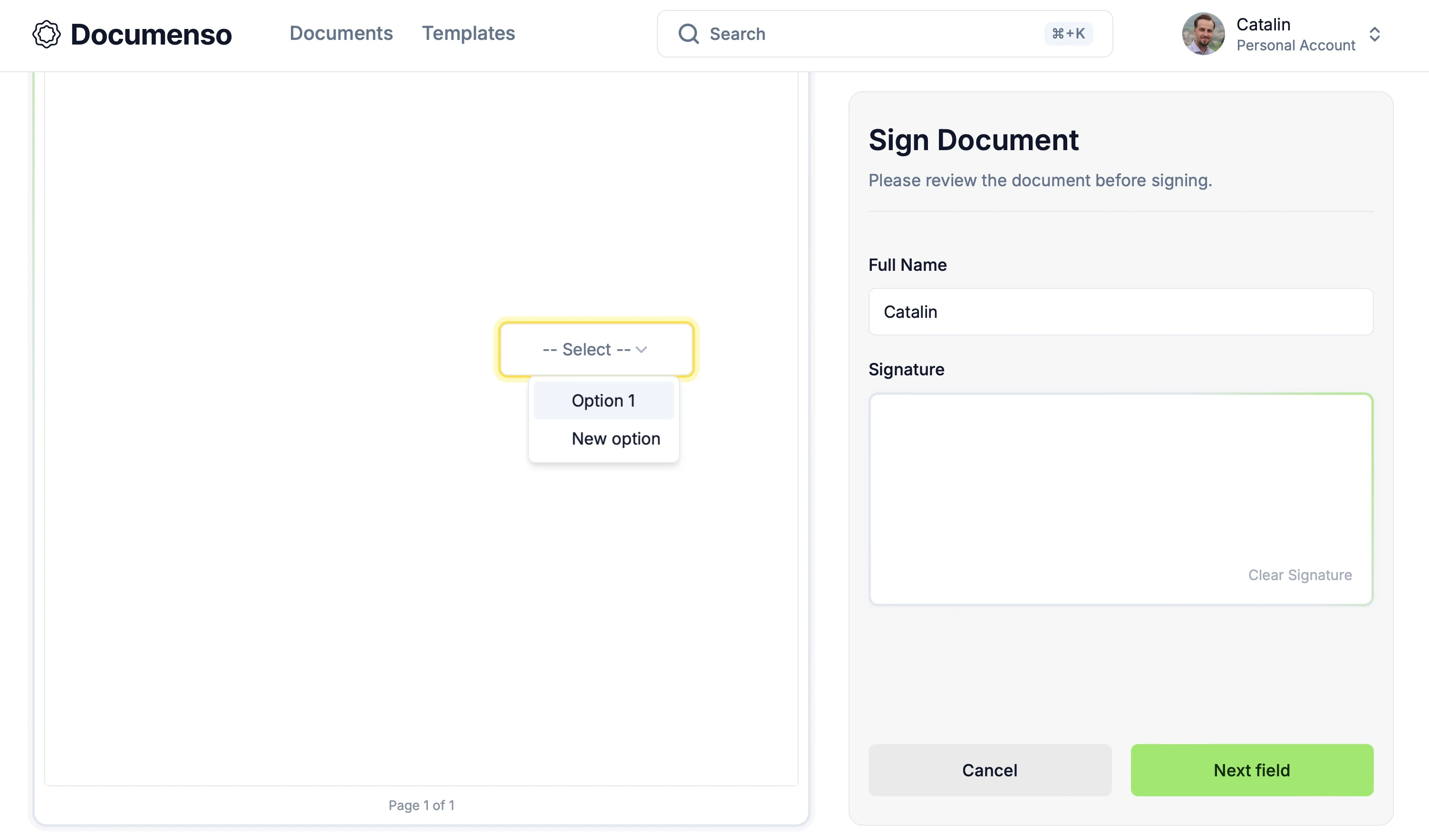
Here's how the "Dropdown/Select" field works:
- If no default value is set, the field will not auto-sign. The signer must click on the field and select an option from the dropdown list to sign it.
- After signing, the field displays the selected value, similar to a signed text field.
- If the field is marked as required, signers must select a value before completing the signing process.
- If the field is marked as read-only, signers can view the selected value but cannot modify it.
Checkbox Field
The last field introduced is the "Checkbox" field, which allows signers to select multiple options from a pre-defined list. This field is helpful for scenarios where signers need to choose multiple items or agree to several terms and conditions, for example.
Before sending the document for signing, you must add at least one checkbox option. This option can contain a string or an empty value and can be checked or unchecked. Unlike the "Radio" field, the "Checkbox" field can have multiple checked options.
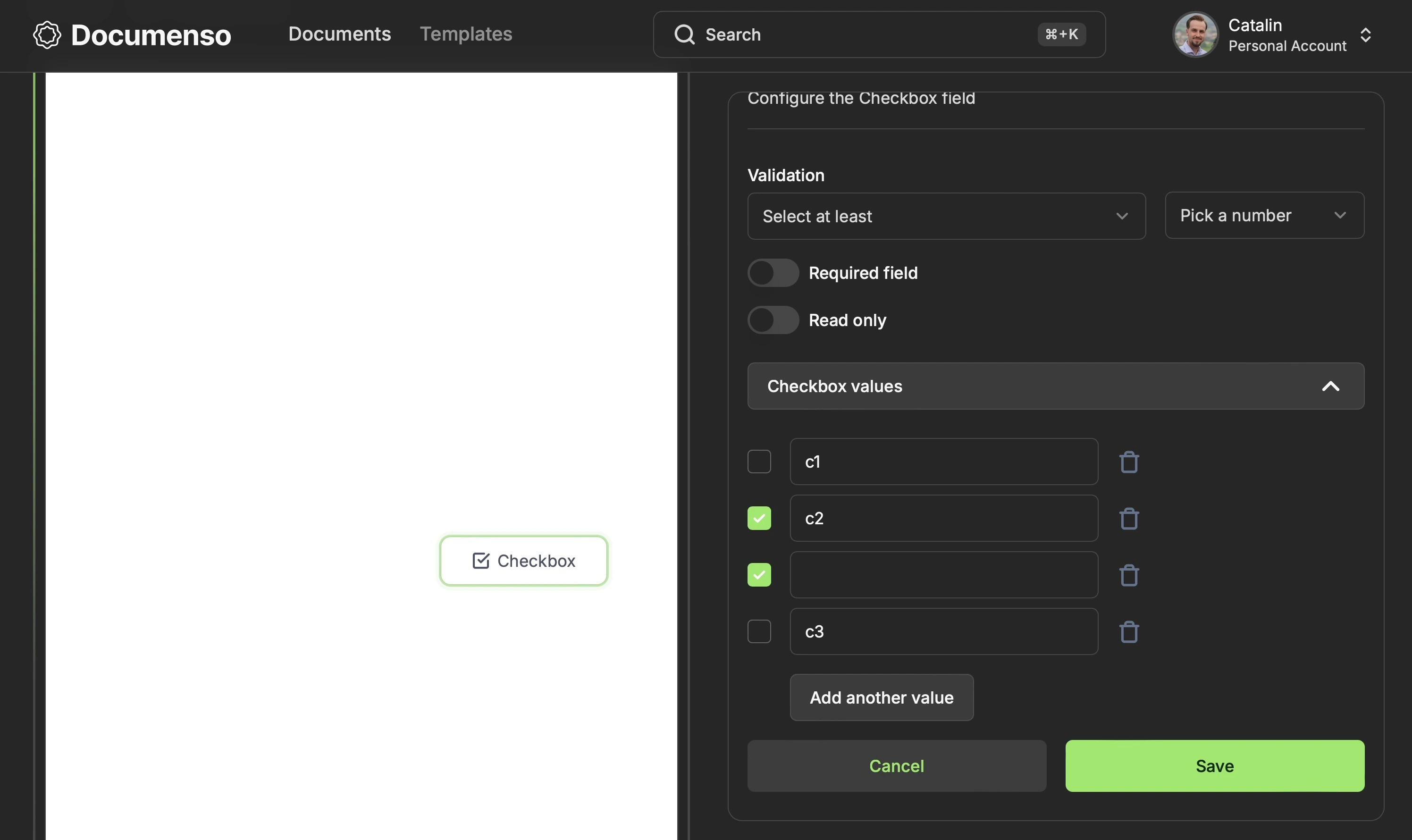
Like other fields, you can mark the "Checkbox" as required or read-only. In addition to that, it also has a validation field, and you can specify how many checkboxes the signer should sign:
- Select at least X (a number from 1 to 10)
- Select at most X (a number from 1 to 10)
- Select exactly X (a number from 1 to 10)
When a signer receives the document, they will see the "Checkbox" field as shown below:
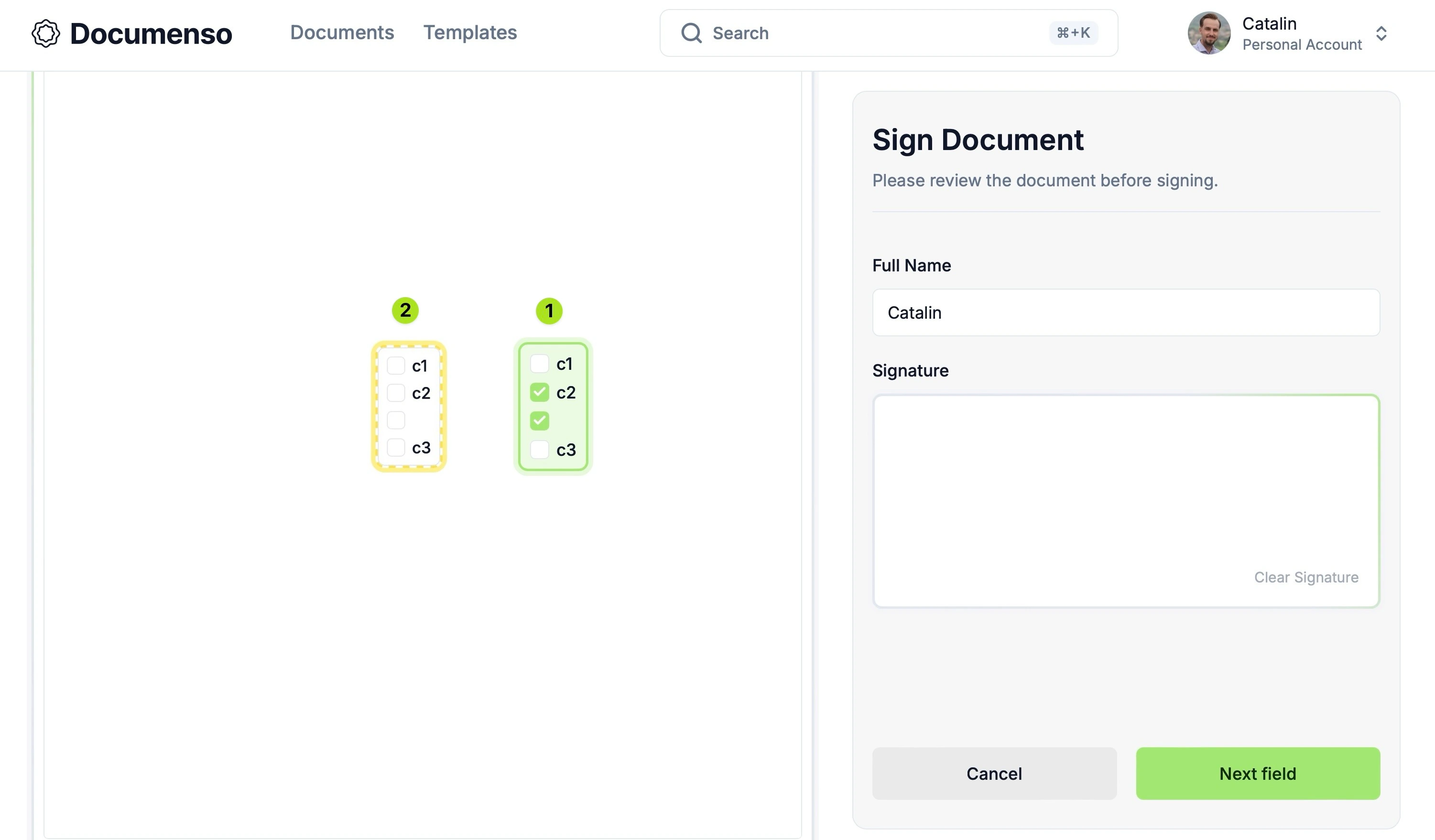
The image illustrates both field states - signed and un-signed. In this example, the 'Checkbox' field has two options checked by default, so it auto-signs.
The field marked '1' appears when the signer visits the page for the first time or when the user refreshes the page and no option is selected. The field marked '2' displays the cleared state, where all choices have been deselected. This shows how the field looks when a user clears all selections.
In this example, no validation rule has been set, allowing the signer to select any options. However, when a validation rule is applied, signers must meet the specified criteria to complete the signing process.
Development Challenges
The introduction of these new fields wasn't without its challenges. The main challenges were:
- Deciding how to store the new information for the fields in the database
- Differentiation of recipients using colours
- Storing the advanced settings for the local fields on the frontend
- Implementing the Checkbox and Radio fields
1st Challenge: Store New Field Information
The first challenge was deciding how to store the extra information for each new field in the database. Each field has unique properties, with only required and read-only shared by all the advanced fields.
The existing Field model in the database looks like this:
model Field {
 id          Int        @id @default(autoincrement())
 secondaryId String     @unique @default(cuid())
 documentId  Int?
 templateId  Int?
 recipientId Int
 type        FieldType
 page        Int
 positionX   Decimal    @default(0)
 positionY   Decimal    @default(0)
 width       Decimal    @default(-1)
 height      Decimal    @default(-1)
 customText  String
 inserted    Boolean
 Document    Document? @relation(fields: [documentId], references: [id], onDelete: Cascade)
 Template    Template? @relation(fields: [templateId], references: [id], onDelete: Cascade)
 Recipient   Recipient  @relation(fields: [recipientId], references: [id], onDelete: Cascade)
 Signature   Signature?

 @@index([documentId])
 @@index([templateId])
 @@index([recipientId])
}
Initially, we considered creating a new FieldMeta table with columns for each field property. However, this approach has 2 issues.
First, the advanced fields only share two common properties: required and read-only. Since all the other properties are unique to each field type, this would result in many nullable columns in the FieldMeta model.
Secondly, creating a new database table with columns for each field property and the associated relationships would increase the database complexity.
As a result, we decided to look for another solution that would better work with our use case.
Solution: JSONB Field
Since the advanced settings data is unique to each field, we decided to store it as JSON using PostgreSQL's JSONB data type. We added a new optional fieldMeta property of type JSONB to the Field model:
model Field {
 id          Int        @id @default(autoincrement())
 secondaryId String     @unique @default(cuid())
 documentId  Int?
 templateId  Int?
 recipientId Int
 type        FieldType
 page        Int
 positionX   Decimal    @default(0)
 positionY   Decimal    @default(0)
 width       Decimal    @default(-1)
 height      Decimal    @default(-1)
 customText  String
 inserted    Boolean
 Document    Document?  @relation(fields: [documentId], references: [id], onDelete: Cascade)
 Template    Template? @relation(fields: [templateId], references: [id], onDelete: Cascade)
 Recipient   Recipient  @relation(fields: [recipientId], references: [id], onDelete: Cascade)
 Signature   Signature?
 fieldMeta   Json? <<<<<----- added this

 @@index([documentId])
 @@index([templateId])
 @@index([recipientId])
}
This approach allows us to store each field's settings as a JSON object. We use Zod schemas to parse and validate the field metadata when reading from or writing to the database to ensure data integrity.
This approach has several benefits:
- Consistency: The application uses the same Zod schema to retrieve and insert data into the database. That means the data is consistent throughout the app.
- Type safety: By parsing the data with Zod, we can guarantee that the data matches the expected types and structure. We can also use Zod's
inferutility to enable strong typing and autocompletion. - Better error handling: Zod provides thorough error messages indicating which part of the data is invalid. That makes it easier & faster to debug and fix issues.
- Maintainability: Reusing the same Zod schema for retrieving and inserting data into the database makes the data structure easier to maintain.
However, using JSONB also has drawbacks like data querying. Since the data is stored as JSON (more specifically, in binary format), complex queries can be less efficient compared to querying normalized relational data. On top of that, querying data requires specific operators and functions, such as ->, ->>, @>, and ?. This makes the querying more verbose and less intuitive, and hence, it requires more finesse.
Another drawback is the storage overhead. JSONB data is stored in a binary format, which can result in some storage overhead compared to normalized relational data. In cases where the JSON data is large or contains a lot of redundant information, the storage overhead can be significant.
Despite these drawbacks, the JSONB type suits our use case, as the field meta information is relatively small and doesn't require complex querying. The flexibility of JSONB matches the dynamic nature of the fieldMeta field.
Postgres provides 2 fields for storing JSON data —
jsonandjsonb. For more information, you can check out the documentation.
2nd Challenge: Storing Fields' Advanced Settings on Frontend
The next challenge was finding the best way to store the advanced field settings entered by users.
Currently, the app only saves the fields and associated settings to the database when the user moves to the next step.
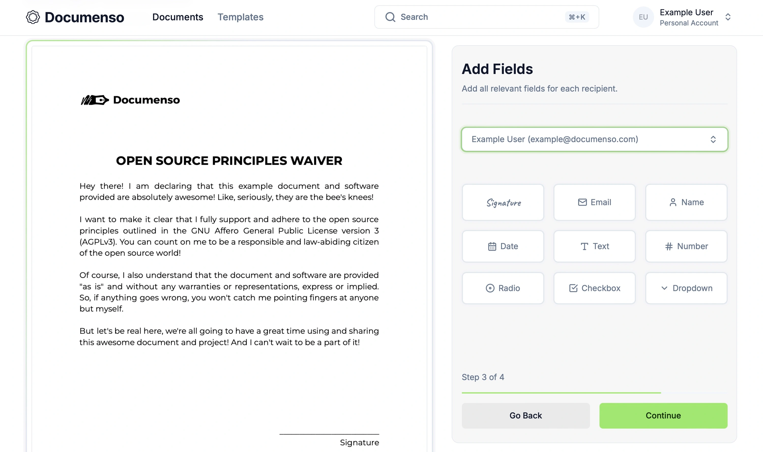
The fields are stored locally until the user proceeds to the next step. This means all fields and their settings are lost when the user:
- Closes the advanced settings tab
- Refreshes the page
- Closes the tab
- Navigates to the previous step
In the future, we plan to improve this flow and save the fields on blur, preserving user data even if they navigate away. However, until then, we needed a solution to save the advanced settings when the user closes the settings tab.
Solution: Local Storage
Our temporary solution is to store the advanced settings in local storage, as the fields are only available locally. If the fields were saved in the database, we could store the advanced settings alongside them.
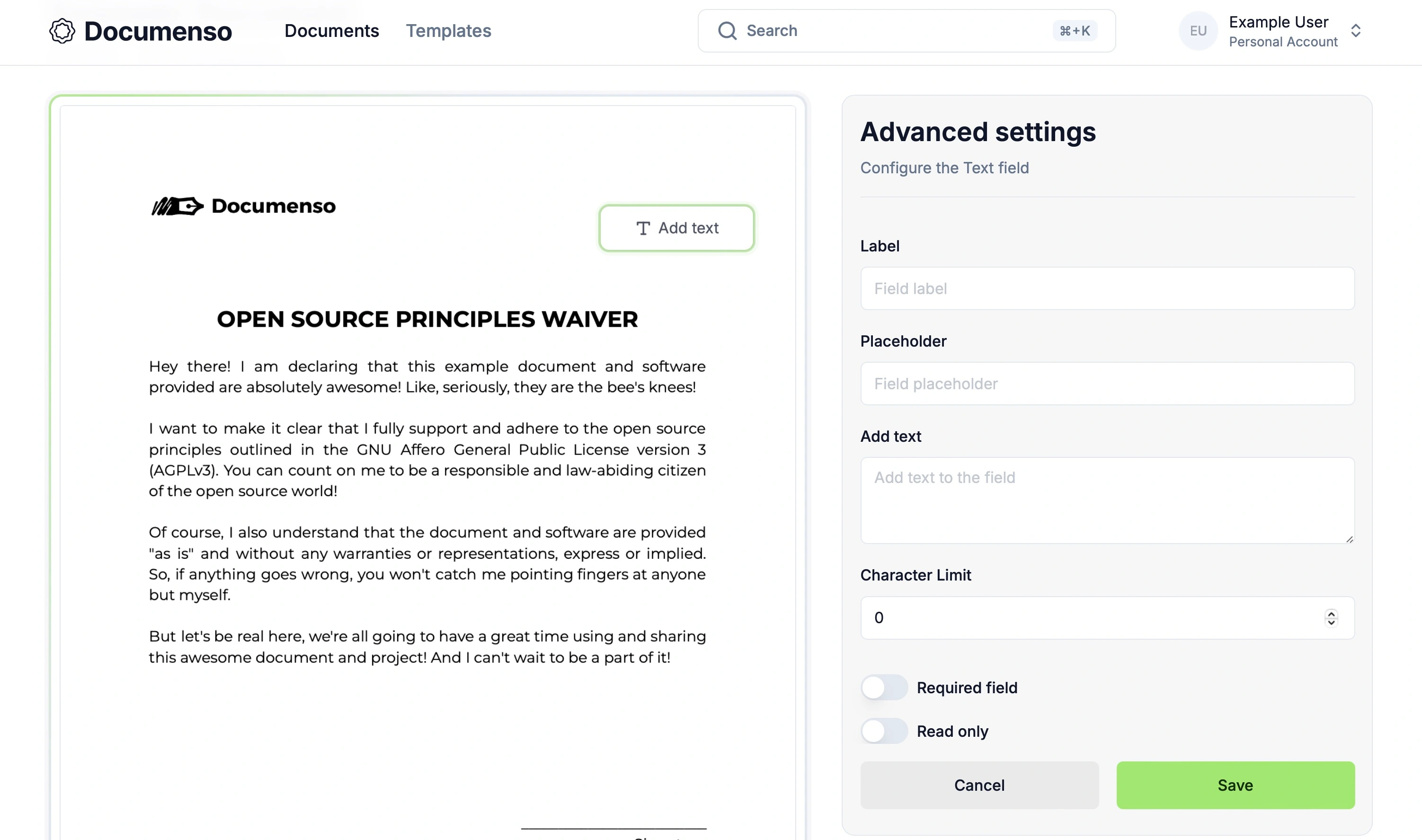
Since the fields are not saved in the database, we must persist the data until the user moves to the next step, at which point the data is saved to the database. Storing the data in local storage allows users to open, close, and configure various fields in the advanced settings tab without losing information.
When the user proceeds to the next step, the fields and their advanced settings are saved into the database, and the local storage is cleared.
We also recognized the dangers of saving data to local storage, as users could modify it and break the application. As a result, we have implemented extensive checks on both the backend and frontend, in addition to parsing and validating data with Zod.
However, this solution has limitations. The data is still lost when the user:
- Refreshes the page
- Navigates to the previous step
- Closes the browser
In these cases, the fields are wiped from the document. A future improvement to save fields to the database on blur will solve this issue.
3rd Challenge: Radio and Checkbox Fields
Implementing the Radio and Checkbox fields was challenging from both logical and design perspectives. Both fields can contain empty and non-empty values, and the Checkbox field allows users to select multiple empty/non-empty values.
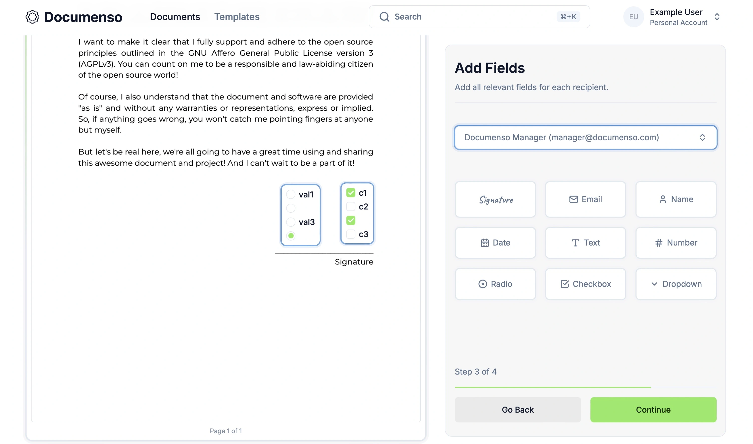
The image above shows the Radio and Checkbox fields in the document editor. The Radio field on the left-hand side has 4 options, 1 of which is checked. The Checkbox field on the right-hand side has 4 options, 2 of which are checked.
The Radio field was easier to implement because users can only select one option, resulting in simpler logic. The signer clicks on an option to choose it, and the field auto-signs with that value. To change the selection, the user clicks another option, un-signing the field and re-signing it with the new value.
The Checkbox field was more challenging because:
- Signers can select multiple options simultaneously, resulting in the field containing multiple values.
- It can have validation rules (e.g., selecting at least, at most, or exactly X options).
- Users can check/uncheck options by clicking them or clear the field with a button.
These factors make the Checkbox field more complex and challenging to implement correctly.
Solution
Instead of focusing on a specific solution, we'll discuss the general implementation and its most challenging aspects. I'll include a link to the complete implementation for each field so you can check it out.
Radio Field
The way signing works for the Radio field is to pull the data from the database and display the available options. If the field has a default value set by the document sender, it auto-signs with that value.
...
  const values = parsedFieldMeta.values?.map((item) => ({
    ...item,
 value: item.value.length > 0 ? item.value : `empty-value-${item.id}`,
 }));
...
  const shouldAutoSignField =
 (!field.inserted && selectedOption) ||
 (!field.inserted && defaultValue) ||
 (!field.inserted && parsedFieldMeta.readOnly && defaultValue);
...

  useEffect(() => {
    if (shouldAutoSignField) {
      void executeActionAuthProcedure({
        onReauthFormSubmit: async (authOptions) => await onSign(authOptions),
 actionTarget: field.type,
 });
 }
 }, [selectedOption, field]);
You can see the complete implementation of the radio field in the radio-field.tsx file.
If the field is not read-only and the user clicks on another option, the field un-signs and re-signs with the new value. Read-only fields cannot be modified.
The value is saved in the database whenever the field is signed, whether by auto-signing or user. Similarly, the value is removed from the database when the field is unsigned.
Since the Radio field can contain empty values, we map over the values and replace the empty ones with a unique string empty-value-${item.id}. This is because the empty string is not a valid value for the field, and we need to differentiate between empty and non-empty values.
Checkbox Field
The Checkbox field implementation is similar to the Radio field, with the main differences being:
- Checkbox fields can contain multiple values.
- Checkbox fields have validation rules that need to be enforced.
...
  const values = parsedFieldMeta.values?.map((item) => ({
    ...item,
 value: item.value.length > 0 ? item.value : `empty-value-${item.id}`,
 }));

  const [checkedValues, setCheckedValues] = useState(
    values
      ?.map((item) =>
        item.checked ? (item.value.length > 0 ? item.value : `empty-value-${item.id}`) : '',
 )
 .filter(Boolean) || [],
 );
...
As with the Radio field, we map over the values and replace empty ones with a unique string. We also keep track of the checked values to display the field correctly and validate them against the validation rules.
...
  const values = parsedFieldMeta.values?.map((item) => ({
    ...item,
 value: item.value.length > 0 ? item.value : `empty-value-${item.id}`,
 }));

  const [checkedValues, setCheckedValues] = useState(
    values
      ?.map((item) =>
        item.checked ? (item.value.length > 0 ? item.value : `empty-value-${item.id}`) : '',
 )
 .filter(Boolean) || [],
 );

  const checkboxValidationRule = parsedFieldMeta.validationRule;
  const checkboxValidationLength = parsedFieldMeta.validationLength;
  const validationSign = checkboxValidationSigns.find(
 (sign) => sign.label === checkboxValidationRule,
 );
...
Then, we retrieve the validation rule and length from the database and find the corresponding validation sign (e.g., ">=", "=", "<=") based on the rule label. The checkboxValidationSigns array maps rule labels to their corresponding signs.
export const checkboxValidationSigns = [
  {
    label: 'Select at least',
    value: '>=',
  },
  {
    label: 'Select exactly',
    value: '=',
  },
  {
    label: 'Select at most',
    value: '<=',
  },
];
We then check if the length condition is met based on the validation rule, sign, and length. If met, the user can proceed with signing the field. Otherwise, they need to select the correct number of options.
...
  const values = parsedFieldMeta.values?.map((item) => ({
    ...item,
 value: item.value.length > 0 ? item.value : `empty-value-${item.id}`,
 }));

  const [checkedValues, setCheckedValues] = useState(
    values
      ?.map((item) =>
        item.checked ? (item.value.length > 0 ? item.value : `empty-value-${item.id}`) : '',
 )
 .filter(Boolean) || [],
 );

  const checkboxValidationRule = parsedFieldMeta.validationRule;
  const checkboxValidationLength = parsedFieldMeta.validationLength;
  const validationSign = checkboxValidationSigns.find(
 (sign) => sign.label === checkboxValidationRule,
 );

  const isLengthConditionMet = useMemo(() => {
    if (!validationSign) return true;
    return (
 (validationSign.value === '>=' && checkedValues.length >= (checkboxValidationLength || 0)) ||
 (validationSign.value === '=' && checkedValues.length === (checkboxValidationLength || 0)) ||
 (validationSign.value === '<=' && checkedValues.length <= (checkboxValidationLength || 0))
 );
 }, [checkedValues, validationSign, checkboxValidationLength]);
...
In summary, the Checkbox field allows signers to select multiple options, with the field automatically signing based on these selections. Signers can un-sign the field by deselecting options or clearing all selections. The system enforces validation rules throughout this process, ensuring signers select the required number of options to sign the field successfully.
You can see the complete implementation of the checkbox field in the checkbox-field.tsx file.
4th Challenge: Recipients' Colors
Another challenge we faced was using colours to differentiate recipients. We needed to dynamically generate and reuse the same Tailwind classes across several components. However, TailwindCSS only includes the CSS classes used in the project, discarding unused ones from the final build. This resulted in colours not being applied to the components, as the classes were not used in the code.
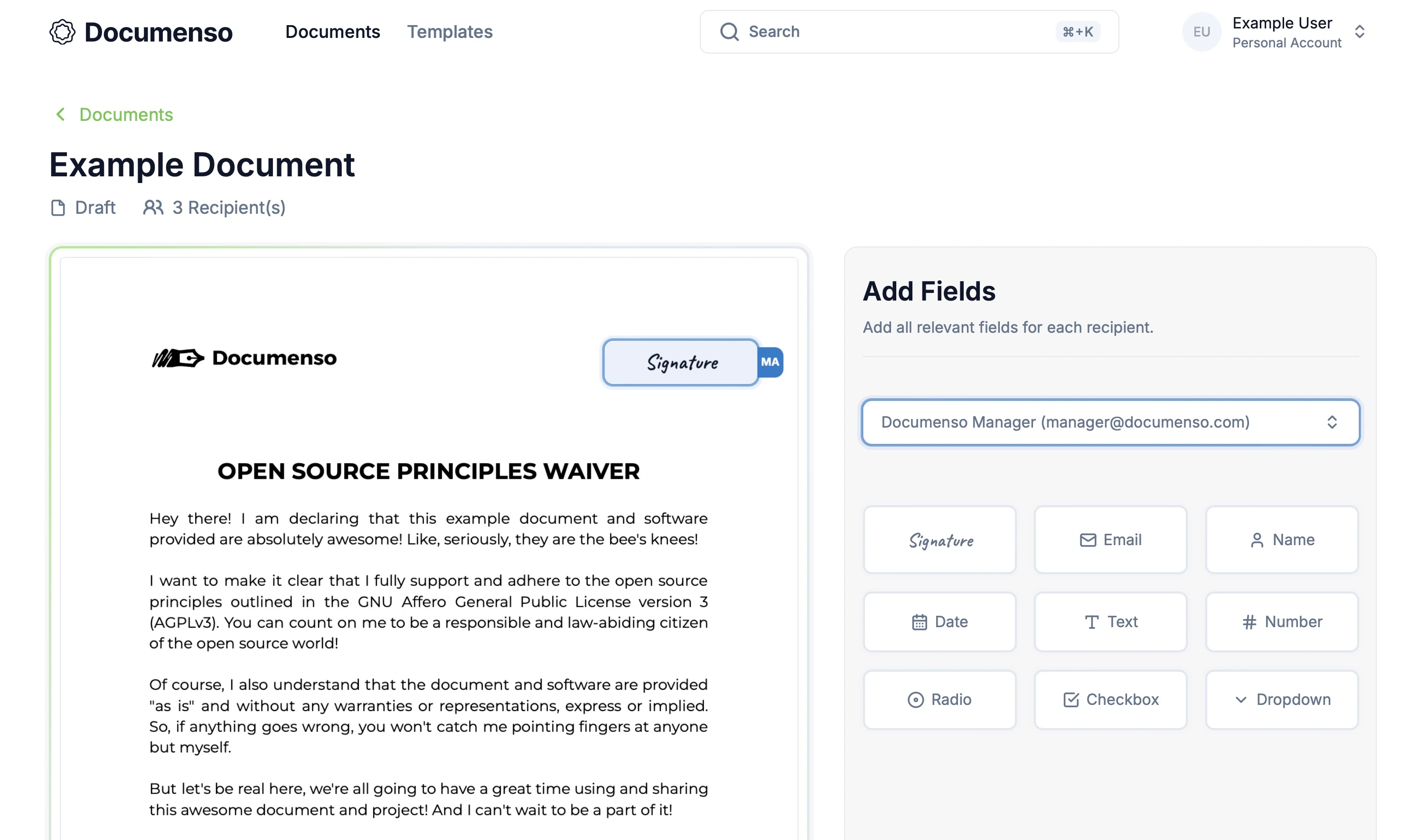
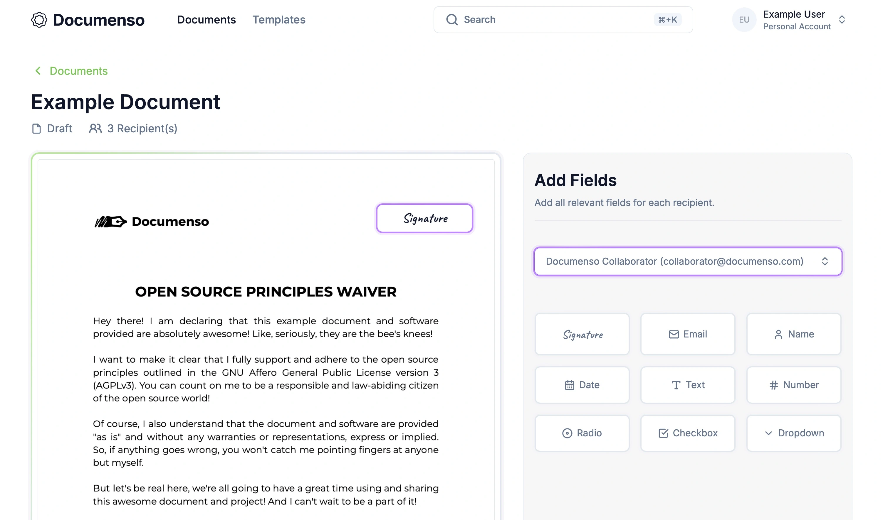
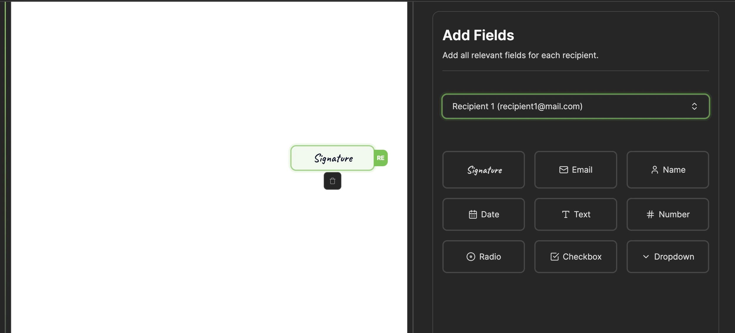
The images below illustrate the recipients' colours in 2 different states.
In the first image, the "Signature" field on the right is in the active state (blue), triggered when the user clicks the field to drag it onto the document. The signature field on the left, placed on the document, is in the normal state.
The first image illustrates the "Signature" field in the active state, triggered when the user clicks on it.
The second image shows the "Signature" field in the normal state.
The document editor consists of various components (fields, recipients, etc.), meaning the same colours and code are reused across multiple components.
export const combinedStyles = {
  'orange-500': {
 ringColor: 'ring-orange-500/30 ring-offset-orange-500',
 borderWithHover: 'border-orange-500 hover:border-orange-500',
    ...,
 },
  'green-500': {
 ringColor: 'ring-green-500/30 ring-offset-green-500',
 borderWithHover: 'border-green-500 hover:border-green-500',
    ...,
 },
  'blue-500': {
 ringColor: 'ring-blue-500/30 ring-offset-blue-500',
 borderWithHover: 'border-blue-500 hover:border-blue-500',
    ...,
  'gray-500': {
 ringColor: 'ring-gray-500/30 ring-offset-gray-500',
 borderWithHover: 'border-gray-500 hover:border-gray-500',
    ...,
 },
  ...,
};

export const MyComponent = () => {
  const selectedSignerStyles = useSelectedSignerStyles(selectedSigner, combinedStyles);

  return (
    <div
      className={cn(
 selectedSigner ? selectedSignerStyles.ringClass : selectedSignerStyles.borderClass,
 )}
    >
      <h1>Hello</h1>
    </div>
 );
};
The code above shows a naive solution using a combinedStyles object containing TailwindCSS classes for various component styles (ring, border, hover, etc.).
Components would use custom hooks to apply appropriate styles based on the selected recipient. For example, recipient 1 would use green-500 styles, turning all related elements green.
The problem with this approach is that we can't import the combinedStyles object into other components because TailwindCSS will remove the unused classes. That means we had to copy and paste the same object into multiple files. As a result, it pollutes the codebase with duplicated code, which makes it harder to maintain and scale the code. As the application grows, the combinedStyles object will become larger and more complex. Moreover, it's not very flexible, as it doesn't allow for easy customization of the colours.
While this approach works, there is a more efficient and scalable solution.
Solution: Modularise the Logic and Use CSS Variables
To address the challenge of reusing colours across components, we moved the colours and associated hooks to a separate file, defining styles only in this file and accessing them from components through custom hooks.
export const SIGNER_COLOR_STYLES = {
 green: {
 default: {
 background: 'bg-[hsl(var(--signer-green))]',
 base: 'rounded-lg shadow-[0_0_0_5px_hsl(var(--signer-green)/10%),0_0_0_2px_hsl(var(--signer-green)/60%),0_0_0_0.5px_hsl(var(--signer-green))]',
 fieldItem:
        'group/field-item p-2 border-none ring-none hover:bg-gradient-to-r hover:from-[hsl(var(--signer-green))]/10 hover:to-[hsl(var(--signer-green))]/10',
 fieldItemInitials:
        'opacity-0 transition duration-200 group-hover/field-item:opacity-100 group-hover/field-item:bg-[hsl(var(--signer-green))]',
 comboxBoxItem: 'hover:bg-[hsl(var(--signer-green)/15%)] active:bg-[hsl(var(--signer-green)/15%)]',
 },
 },

  ...
};

export type CombinedStylesKey = keyof typeof SIGNER_COLOR_STYLES;

export const AVAILABLE_SIGNER_COLORS = [
  'green',
  'blue',
  'purple',
  'orange',
  'yellow',
  'pink',
] as const satisfies CombinedStylesKey[];

export const useSignerColors = (index: number) => {
  const key = AVAILABLE_SIGNER_COLORS[index % AVAILABLE_SIGNER_COLORS.length];

  return SIGNER_COLOR_STYLES[key];
};

export const getSignerColorStyles = (index: number) => {
  return useSignerColors(index);
};
The file was truncated for readability. You can see the complete code in the signer-colors.ts file from the Documenso repository.
The SIGNER_COLOR_STYLES object contains the styles for each colour, such as the background, border, and hover colours. Based on the signer's index, the useSignerColors hook gets the styles for a specific colour. The getSignerColorStyles function is a helper function that returns the styles for a particular signer.
Now, the components can access the colours and styles using custom hooks. For example, to get the styles for a specific signer, the component can call the useSignerColors hook with the signer's index.
const signerStyles = useSignerColors(recipientIndex);
The hook will return the styles for that signer, which can then be applied to the component. For example, you can access the signer's background colour using signerStyles.default.background.
This approach makes managing the colours and styles easier, as they are defined in a single file. Changing or adding colours can be done in one place, making the code more modular and reusable.
We also opted for CSS variables to define colours, allowing more flexibility and consistency in styling. A single CSS variable for each colour can cover a wide range of states without relying on multiple TailwindCSS classes. For example, you can easily set the opacity and lightness of colour without using multiple classes. CSS variables help align colours with our brand guidelines while simplifying the overall styling process.
The End
We're happy to see the new advanced fields released because they offer our users more flexibility, variety, and customization options. Implementing the new fields came with its challenges, but we overcame them and learned from them. We're excited to continue enhancing Documenso and providing our users with the best document signing experience.

